Overview
A guide to mastering CPR
CPR+ is a dynamic platform that encompasses a mobile app and a website aimed at educating users on the proper techniques of CPR.
The mobile app is designed to aid in emergencies by giving users real-time, step-by-step instructions on performing CPR.
The website provides an in-depth training tool, providing users with certification options for different CPR situations.
Challenges
Challenge 1
Despite its life-saving potential, many people lack CPR skills, leading to hesitation in emergencies.
Challenge 2
Many people can't get CPR certified due to in-person class requirements, limiting their ability to learn and retain emergency procedures.
Objectives
• Develop an app that addresses the issue of insecurity and lack of proficiency in CPR during emergencies by offering portable guidance and support for performing CPR correctly.
• Additionally, creating an online platform for at-home study and on-the-go learning would greatly benefit users.
👩🏻💻 Role
UX/UI Designer
Led the design process from the initial research phase to the final delivery.
Project Duration
August - October 2022
✔ Conducted user research to understand the needs and pain points of the target audience.
✔ Defined user personas and scenarios.
✔ Created low-fidelity wireframes, high-fidelity mockups, and interactive prototypes to visualize the user interface and user flow.
✔ Established and organized the information architecture, creating an intuitive and easy-to-navigate structure for users.
✔ Ensured accessibility and responsiveness of the app, designing for different devices and screen sizes.
User
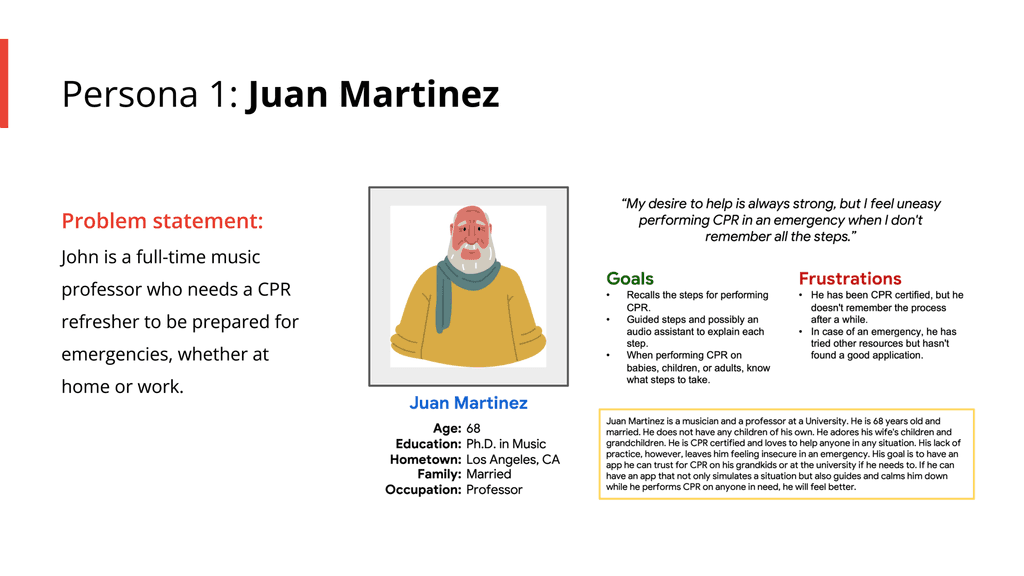
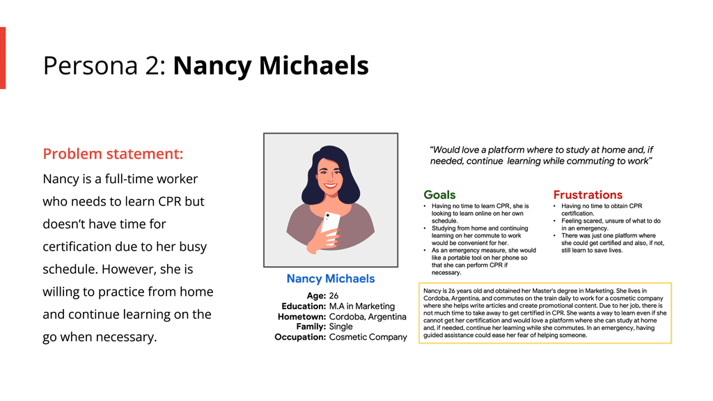
Personas
Competitive Audit
I conducted a competitive analysis of various mobile apps in the same category, focusing on navigation, layout, and overall design. I also evaluated the ease of use and effectiveness of each app’s features and functionality.
CPR & First AID
The app is a comprehensive CPR training tool with interactive illustrations and easy navigation. It offers written content and videos but lacks audio narration. Users must log in, which may be inconvenient in emergencies, and some may find the small buttons and large amount of content overwhelming.
PocketCPR
This Apple watch app provides quick CPR tutorials and a timer for chest compressions. It also offers haptic cues but lacks visuals, has small text, and would benefit from audio narration. While it includes a resource link, users must access it on their mobile devices.
CPR Tempo
The app helps users maintain the correct tempo for chest compressions during CPR with an easy-to-use timer and audible beat count. A heart illustration aids in tracking the tempo, and a tutorial on defibrillator use is included. However, it lacks additional CPR visuals and guidance for the initial stages of an emergency.
Livesaver
Lifesaver is an interactive app that uses video simulations to teach CPR through quick decision-making scenarios, similar to a choose-your-own-adventure game. The time-sensitive situations add urgency, and the gamification helps users retain critical procedures. Its engaging, hands-on approach makes it stand out from other CPR apps.
Ideation
I used the Crazy Eights technique to brainstorm ideas that address gaps from the user personas and competitive audit, focusing on ensuring the app's initial steps are usable in emergencies, even for those unfamiliar with CPR.
Design & Prototype
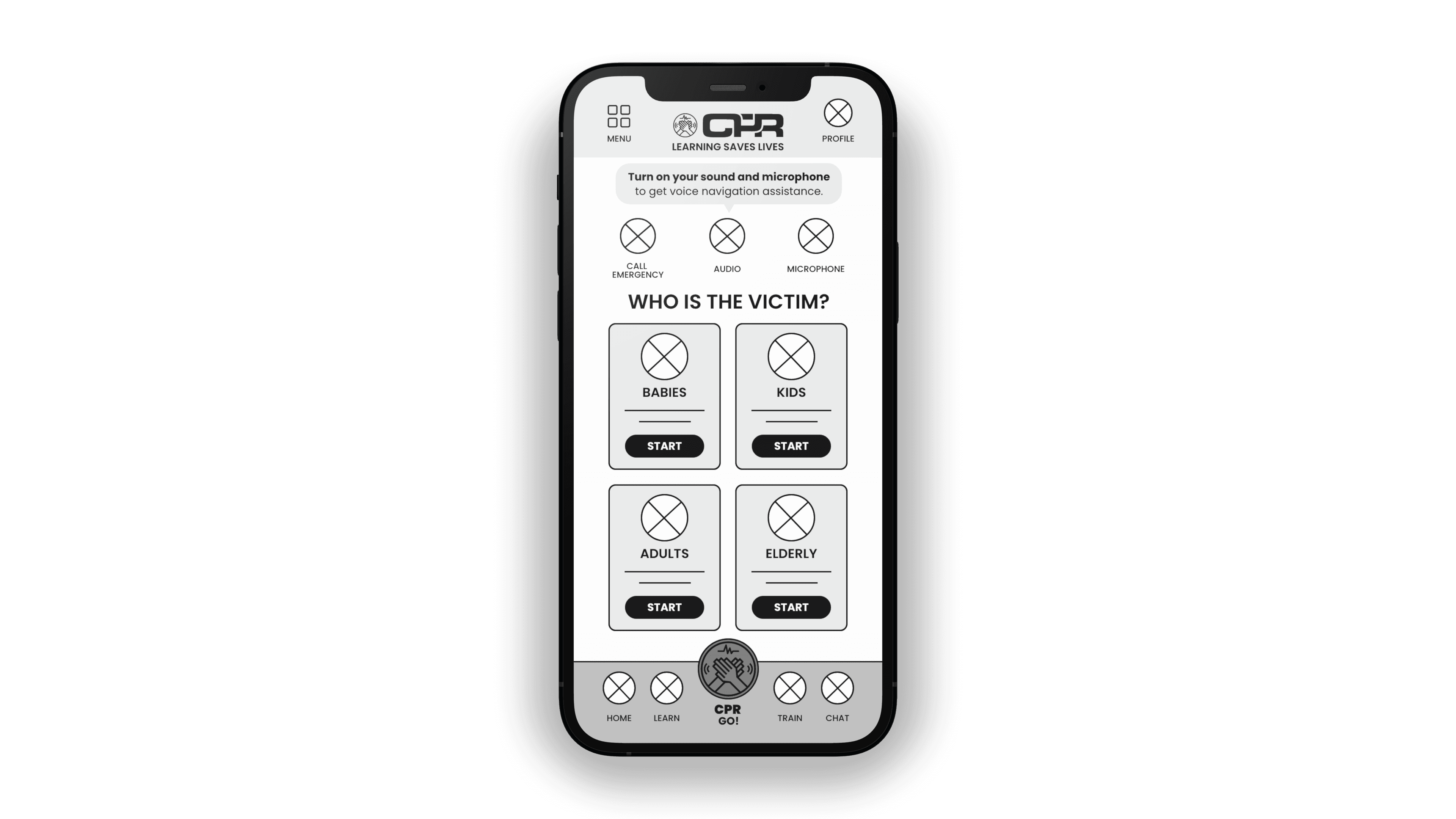
Digital Wireframes
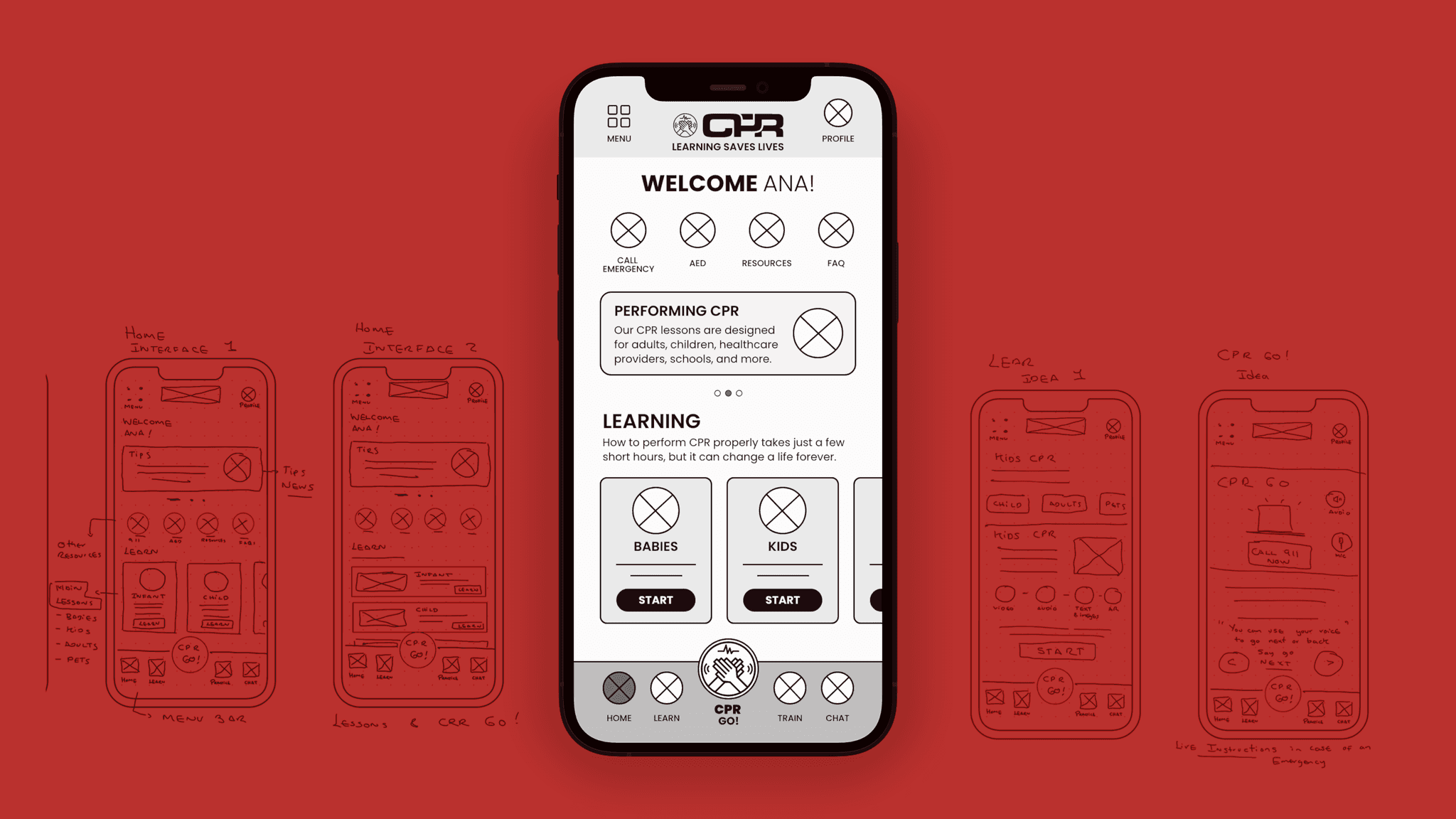
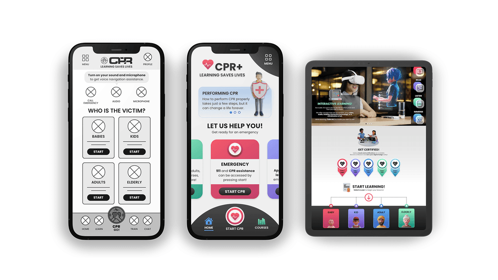
After creating paper wireframes, I designed the CPR+ mobile app to guide users through CPR steps until emergency help arrives.
Low-Fidelity Prototype
High-Fidelity Prototype
Website Prototype
Takeaways
Takeaway 1
Users expressed that the CPR+ app gave them a greater sense of security during emergencies. They appreciated the ability to call emergency services while simultaneously refreshing their memory on CPR procedures.
Takeaway 2
Moreover, the responsive website design allowed users to learn different CPR techniques through various media formats and conveniently access the site from any device, thanks to its adaptability.
